Sticky Contact Sidebar – Full Documentation
Introduction
HansAndFriends Sticky Contact Sidebar is a lightweight WordPress plugin that adds a clean, fixed contact panel to the side of your website.
It is built for one goal: make important contact options available instantly without adding unnecessary complexity.
✅ Improve conversion with always-accessible contact actions
✅ Keep the interface compact with peek + expand behavior
✅ Configure content, links, colors, and typography directly in WordPress
Features Overview
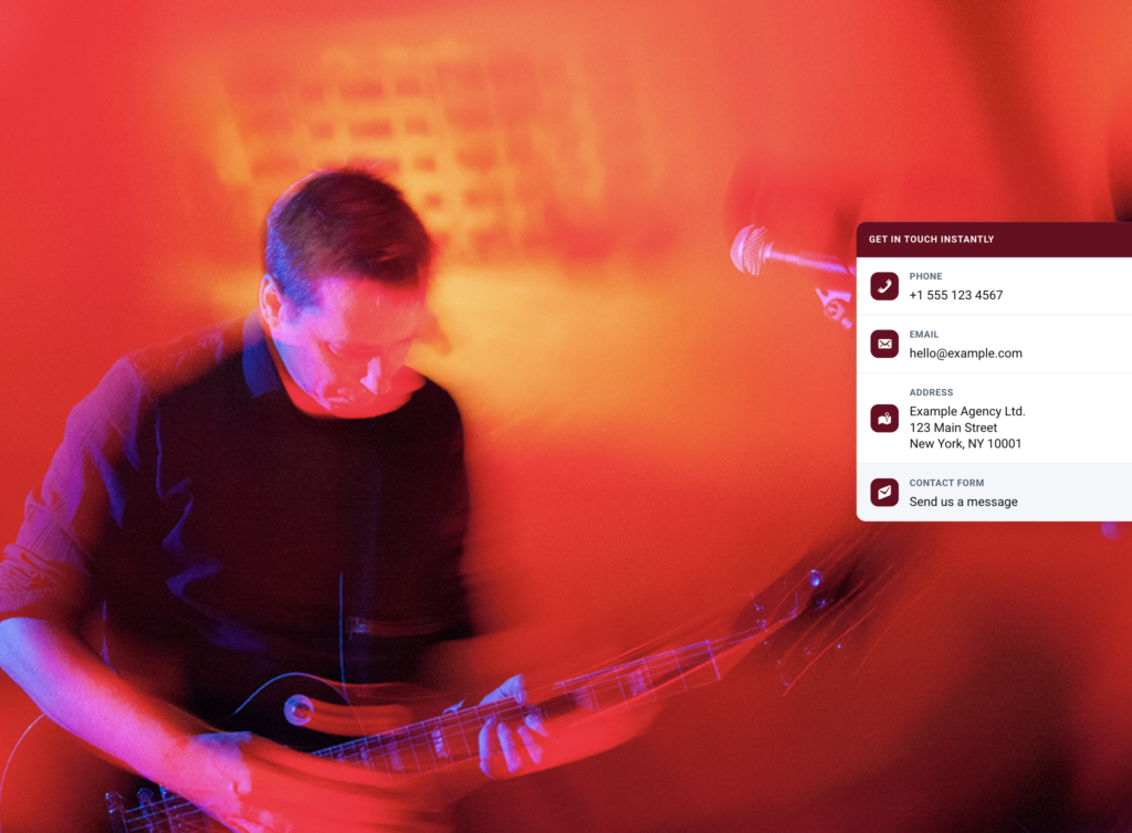
📌 Sticky contact sidebar on the frontend
- Stays visible in peek mode and expands on hover/focus.
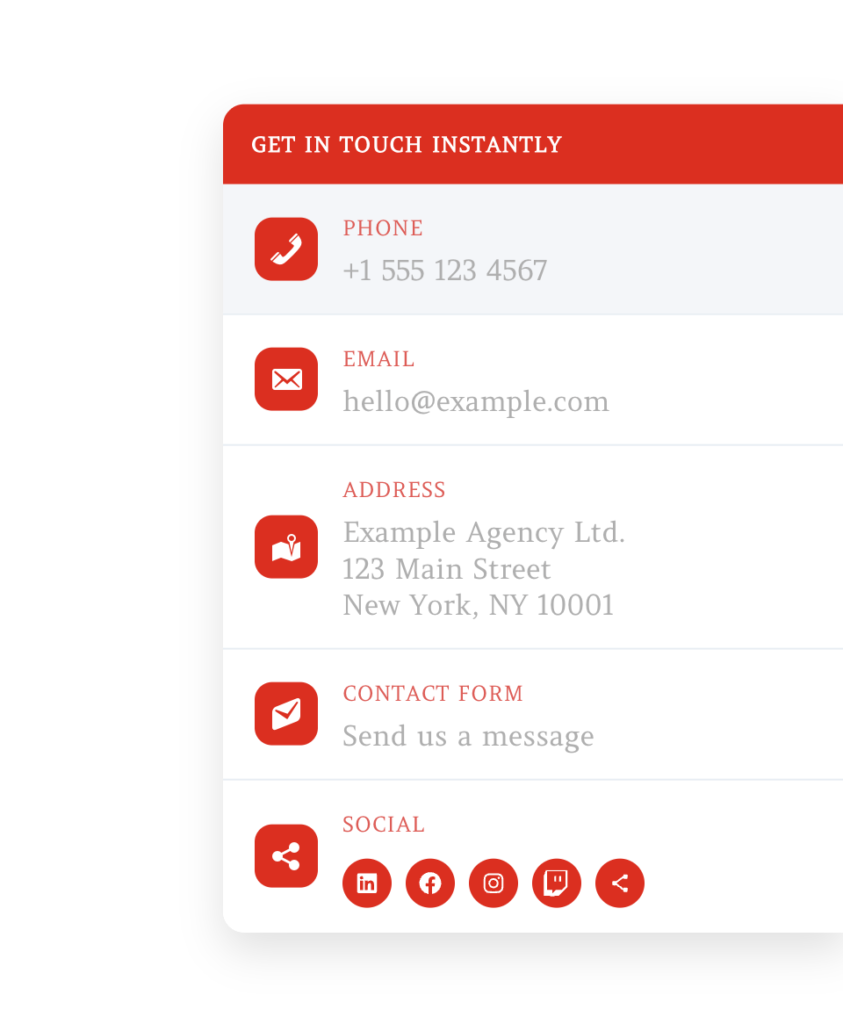
⚙️ Editable contact content
- Separate Label, Text, and Link fields for Phone, Email, Address, and Contact Form.
🧩 Per-item visibility toggles
- Enable/disable each block independently:
- Phone
- Address
- Contact Form
- Social
🗺️ Address maps behavior
- Optional automatic Google Maps link generation for address content.
🌐 Social links with auto-detected icons
- Enter profile URLs and the plugin detects the platform icon automatically.
- Includes support for major networks and a fallback icon for unknown links.
🎨 Style controls
- Accent color
- Label color
- Text/value color
🔤 Typography controls
- Use theme font stack
- Use Google Fonts CDN
- Use Google Fonts locally (recommended)
- Global Label weight and Text weight
- Optional custom local
.woff2upload:- one file for labels
- one file for text/values
📱 Mobile behavior settings
- Optional disable on mobile
- Custom breakpoint (px)
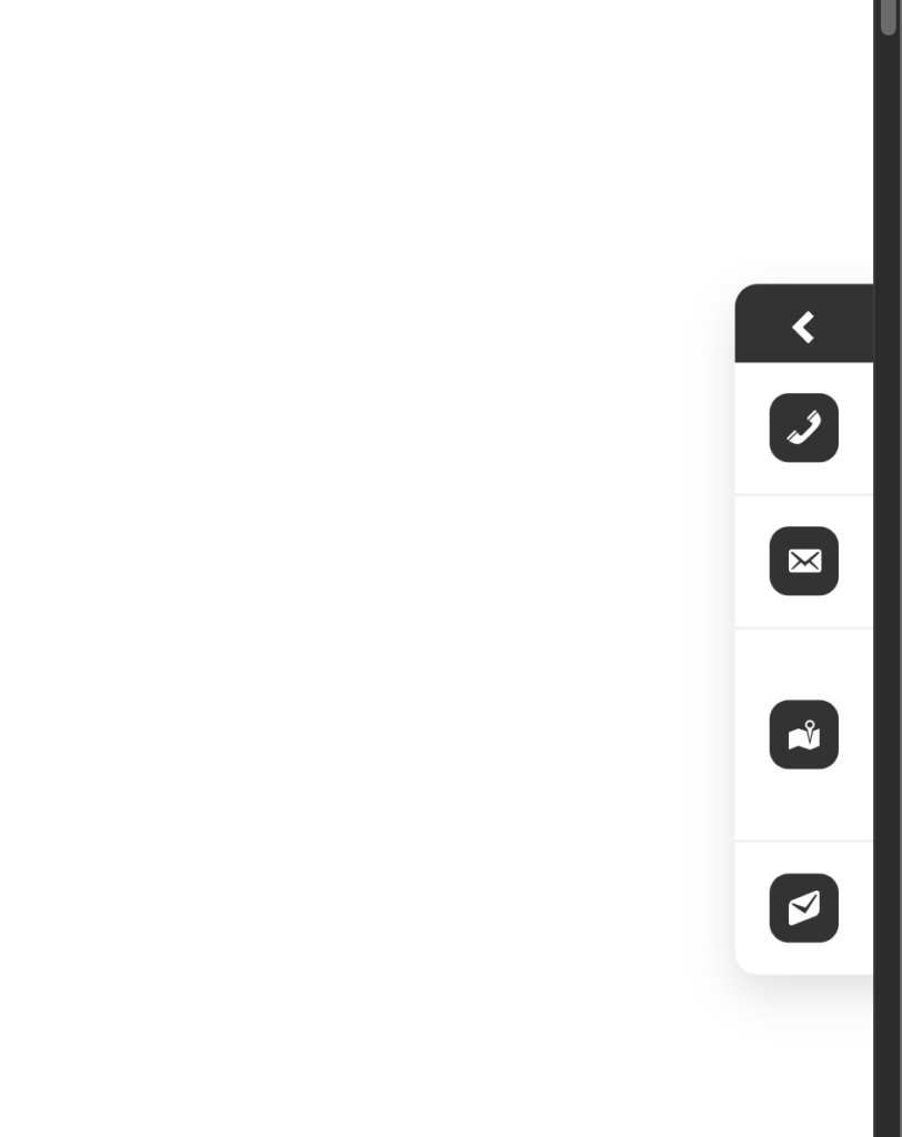
👀 Peek behavior options
- Default: visible in peek mode
- Optional: show peek only after scroll
Installation & Setup
- Install from WordPress.org
- Go to
Plugins -> Add New - Search for
HansAndFriends Sticky Contact Sidebar - Click Install Now and Activate
- Open settings
- Go to
Settings -> HansAndFriends Sticky Contact Sidebar
- Configure content and behavior
- Fill in contact fields
- Set links
- Choose typography mode
- Adjust colors and mobile/peek behavior
Configuration Guide
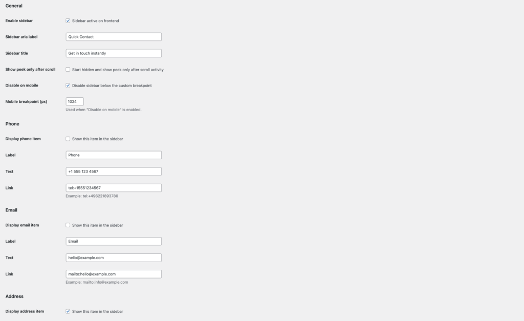
1) General
- Enable sidebar: Turn frontend output on/off.
- Sidebar aria label: Accessibility label for assistive technologies.
- Sidebar title: Header text shown at the top of the sidebar.
- Show peek only after scroll: Starts hidden and reveals peek only after user scroll activity.
- Disable on mobile: Hide sidebar below your selected breakpoint.
- Mobile breakpoint (px): Custom cutoff for mobile disabling.
2) Contact Items (Phone, Email, Address, Contact Form)
Each contact item supports:
- Display item toggle
- Label (e.g., “Phone”)
- Text (what users see)
- Link (where click goes)
Examples:
- Phone link:
tel:+15551234567 - Email link:
mailto:hello@example.com - Contact form link:
https://example.com/contact/
3) Address Maps Toggle
When enabled, address text can be linked automatically to Google Maps search.
4) Social Item
- Enable Display social item in sidebar
- Set custom label (default:
Social) - Add social profile links
- Plugin detects the right icon based on each URL
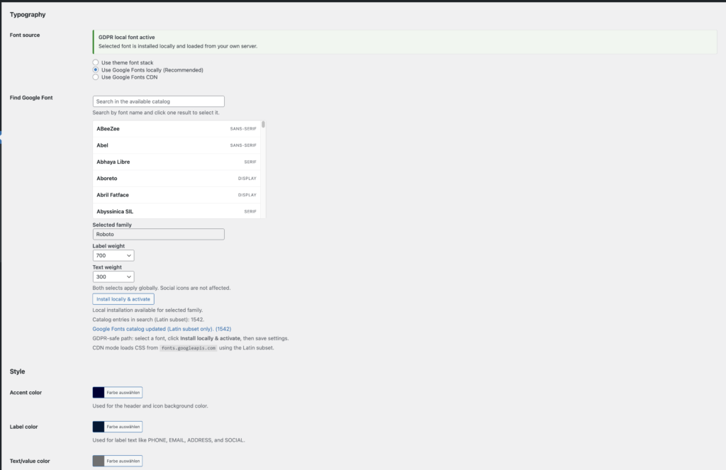
5) Typography
Choose one font source mode:
- Use theme font stack
- Use Google Fonts locally (Recommended)
- Use Google Fonts CDN
Additional typography controls:
- Find Google Font search
- Selected family
- Label weight (global)
- Text weight (global, social icon glyphs excluded)
- Optional local
.woff2overrides for labels and text/values
6) Colors
- Accent color: header + icon tiles
- Label color: labels like PHONE, EMAIL, ADDRESS
- Text/value color: visible values like number, email, address text
Privacy & External Services
Typography mode determines external requests:
- Theme font stack: depends on the active theme.
- Google Fonts CDN mode: frontend requests Google Fonts.
- Google Fonts local mode: selected fonts are downloaded and served locally from your server.
For full legal/technical details (services, data flow, terms/privacy links), see the plugin readme.txt section External services.
Troubleshooting & FAQ
❓ The sidebar is not visible on mobile.
Check:
Disable on mobilesetting- configured breakpoint value
❓ My font does not look as expected.
Check:
- active font mode
- selected family and weights
- whether local
.woff2overrides are set (these override Google/theme family for the mapped targets)
❓ Social icon is not recognized.
Use the full profile URL (including domain), e.g.:
https://www.linkedin.com/in/...https://www.instagram.com/...
If no match is found, the fallback icon is used.
❓ Address click does not open the expected map.
Verify:
- address text content
- maps-link option state
- custom link field (if used instead of automatic mapping)
Best Practice Tips
- ✅ Keep labels short and clear (PHONE, EMAIL, ADDRESS)
- ✅ Use direct-action links (
tel:andmailto:) - ✅ Use local font mode for privacy-focused setups
- ✅ Keep strong contrast between label/text and background
- ✅ Test on desktop + mobile breakpoints after each design change
Suggested Screenshots for This Documentation
Use these images to mirror your WordPress.org assets:
Full sidebar with contact blocks
Alternative color/font style/social-enabled variant
Collapsed peek state
Admin general settings screen
Admin typography and style screen
CSS Customization Examples
If you need layout tweaks beyond the backend controls, use custom CSS in your theme or in Appearance -> Customize -> Additional CSS.
Example 1: Remove all rounded corners
#hs-sticky-sidebar,
#hs-sticky-sidebar .hs-sticky-head,
#hs-sticky-sidebar .hs-sticky-item,
#hs-sticky-sidebar .hs-sticky-icon,
#hs-sticky-sidebar .hs-sticky-social-link {
  border-radius: 0 !important;
}
Example 2: Make icons perfectly circular
#hs-sticky-sidebar .hs-sticky-icon,
#hs-sticky-sidebar .hs-sticky-social-link {
  border-radius: 999px !important;
}
Example 3: Increase sidebar width
#hs-sticky-sidebar {
  width: 420px !important;
}
Example 4: Increase spacing between rows
#hs-sticky-sidebar .hs-sticky-item {
  padding-top: 24px !important;
  padding-bottom: 24px !important;
}
Example 5: Larger labels and values
#hs-sticky-sidebar .hs-sticky-label {
  font-size: 28px !important;
}

#hs-sticky-sidebar .hs-sticky-value {
  font-size: 34px !important;
}
Example 6: Always keep the sidebar visible (no hide animation)
#hs-sticky-sidebar {
  transform: translateX(0) !important;
}
Important CSS Selectors (Advanced)
These are useful selectors for parts that are not directly configurable via backend fields:
#hs-sticky-sidebar- Whole sidebar container (position, width, shadow, transitions).
#hs-sticky-sidebar .hs-sticky-head- Top header area (background, spacing, title alignment).
#hs-sticky-sidebar .hs-sticky-title- Header title text (“Get in touch instantly”).
#hs-sticky-sidebar .hs-sticky-item- One row/block (phone, email, address, contact form, social).
#hs-sticky-sidebar .hs-sticky-item + .hs-sticky-item- Divider/border area between rows.
#hs-sticky-sidebar .hs-sticky-icon- Left icon tile (size, border radius, background).
#hs-sticky-sidebar .hs-sticky-label- Label text (PHONE, EMAIL, ADDRESS, SOCIAL).
#hs-sticky-sidebar .hs-sticky-value- Main value text (number, email, address lines, CTA text).
#hs-sticky-sidebar .hs-sticky-social-list- Social icon row container.
#hs-sticky-sidebar .hs-sticky-social-link- Individual social icon button.
#hs-sticky-sidebar .hs-sticky-social-svg- Inner social SVG icon itself (fill/size).
#hs-sticky-sidebar.is-peek- Sidebar state when collapsed/peeked.
#hs-sticky-sidebar.is-visible- Sidebar state when actively shown.
Tip: Inspect these elements in browser DevTools and test CSS step by step before applying final rules.